728x90
import numpy as np
import pandas as pd
import matplotlib.pyplot as plt
# 데이터 불러오기
df = pd.read_csv('data/ch4_scores400.csv')▷ 표본 추출 방법
(모집단 : 추측하고 싶은 관측 대상 전체 // 표본 : 추측에 사용하는 관측 대상의 일부분 // 표본크기 : 표본의 수)
- 무작위 추출(임의 추출): 임의로 표본을 추출하는 방법
- 복원추출: 여러 차례 동일한 표본을 선택하는 방법
- 비복원추출: 동일한 표본은 한번만 선택하는 방법
# 복원 추출
np.random.choice([1,2,3],3)

# 비복원 추출
np.random.choice([1,2,3],3,replace=False)

# 시드를 0으로 하는 무작위추출
np.random.seed(0)
np.random.choice([1,2,3],3)

# 표본크기 20으로 복원추출, 표본평균 계산
np.random.seed(0)
sample=np.random.choice(scores,20)
sample.mean()
▷ 확률의 기본
| 확률 | 무작위 추출과 같은 불확정성을 수반한 현상을 해석 |
| 확률변수 | 결과를 알아맞힐수는 없지만, 취하는 값과 그 값이 나올 확률이 결정되어 있는 것 |
| 시행 | 확률변수의 결과를 관측하는 것 |
| 실현값 | 시행에 의해 관측되는 값 |
| 사건 | 시행 결과로 나타날 수 있는 값 |
| 근원사건 | 세부적으로 더 분해될 수 없는 사건 |
| 상호배반 | 동시에 일어날 수 없는 사건 |
| 확률 모형 | 무작위 추출 혹은 주사위를 모델링 |
▷ 확률분포
- 확률변수가 어떻게 움직이는지를 나타낸 것
dice = [1,2,3,4,5,6]
prob=[1/21,2/21,3/21,4/21,5/21,6/21]

num_trial = 100
sample = np.random.choice(dice,num_trial,p=prob)

# DataFrame 만들기
freq,_=np.histogram(sample, bins=6, range=(1,7))
pd.DataFrame({'frequncey':freq,
              'relative frequency':freq/num_trial},
             index=pd.Index(np.arange(1,7),name = 'dice'))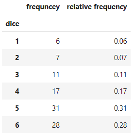
fig = plt.figure(figsize=(10,6))
ax=fig.add_subplot(111)

# density:밀도함수, 막대의 면적을 다 합치면 1
ax.hist(sample,bins=6,range=(1,7),density=True,rwidth=0.8)
# hlines(수평), vlines(수직)으로 선긋기
# np.arange(1,7) -> min값, np.arange(2,8) -> max값
ax.hlines(prob,np.arange(1,7),np.arange(2,8),colors='gray')

# 눈금 만들기
ax.set_xticks(np.linspace(1.5,6.5,6))
ax.set_xticklabels(np.arange(1,7))
ax.set_xlabel('dice')
ax.set_ylabel('relative frequency')

plt.show()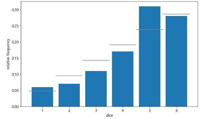
if ) 시행 횟수를 10000번으로 늘렸을 때 결과 비교하기 → 실제의 확률분포에 가까워짐.
num_trial = 100000
sample = np.random.choice(dice,num_trial,p=prob)

fig = plt.figure(figsize=(10,6))
ax=fig.add_subplot(111)
ax.hist(sample,bins=6,range=(1,7),density=True,rwidth=0.8)
ax.hlines(prob,np.arange(1,7),np.arange(2,8),colors='gray')
ax.set_xticks(np.linspace(1.5,6.5,6)) # 눈금 만들기
ax.set_xticklabels(np.arange(1,7))
ax.set_xlabel('dice')
ax.set_ylabel('relative frequency')
plt.show()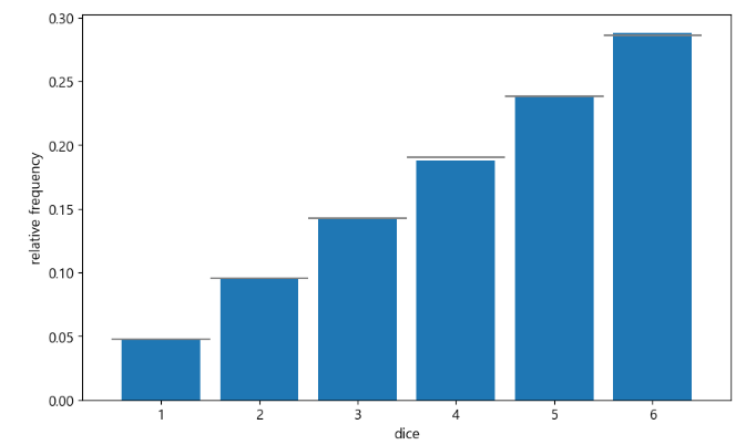
- 계급폭을 1점으로 하는 히스토그램 그리기
fig = plt.figure(figsize=(10,6))
ax=fig.add_subplot(111)
ax.hist(scores,bins=100,range=(10,100),density=True)
ax.set_xlim(20,100)
ax.set_ylim(0,0.042)
ax.set_xlabel('score')
ax.set_ylabel('relative frequency')
plt.show()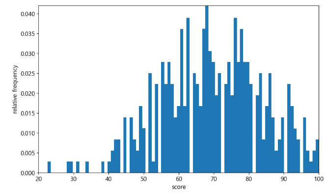
if ) 시행 횟수를 100번 & 100000번으로 했을 때 그래프 비교하기 → 시행횟수를 늘렸을 때 실제분포와 가까워짐
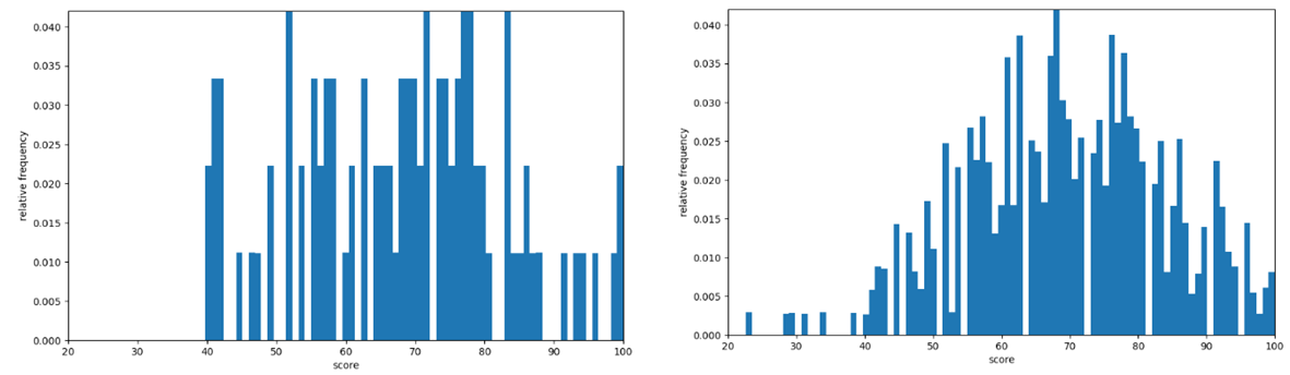
시행횟수 100번 시행횟수 100000번
- 표본크기가 20인 표본을 추출하여 표본평균을 계산하는 작업을 10000번 수행했을 때 그래프 그리기
(표본평균은 모평균을 중심으로 분포 → 무작위 추출에 의한 표본평균으로 모평균 추측 가능)
# 변수를 선언하지 않고싶으면 _ ← 로 대체
sample_means=[np.random.choice(scores,20).mean()
              for _ in range(100000)]
fig = plt.figure(figsize=(10,6))
ax=fig.add_subplot(111)
ax.hist(sample_means,bins=100,range=(0,100),density=True)
# 모평균을 세로선으로 표시
ax.vlines(np.mean(scores),0,1,'gray')
# x 범위값
ax.set_xlim(50,90)
# y 범위값
ax.set_ylim(0,0.13)
ax.set_xlabel('score')
ax.set_ylabel('relative frequency')

plt.show()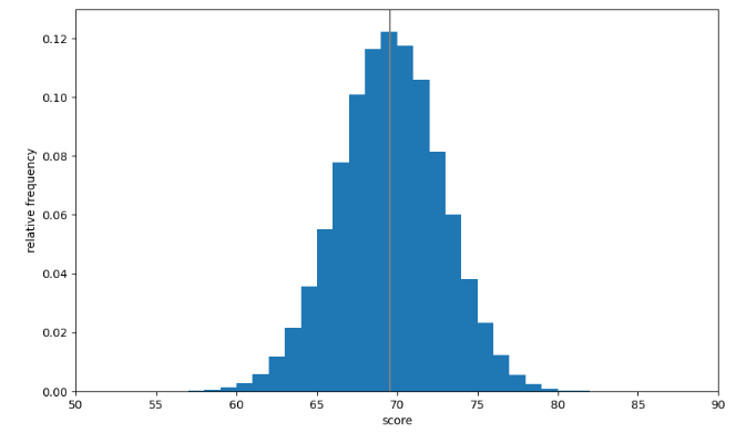
'개념정리 > Python' 카테고리의 다른 글
| ▷ 대표적인 이산형 확률변수 - 베르누이 분포, 이항분포, 기하분포, 포아송분포 (2) | 2023.03.22 |
|---|---|
| ▷ 이산형 확률변수 - 1 · 2차원 이산형 확률변수 (0) | 2023.03.22 |
| ▷ Python 2차원 데이터 정리 - 공분산, 상관계수, 산점도, 회귀직선, 히트맵 (0) | 2023.03.19 |
| ▷ Python 1차원 데이터 정리(PART 3) - 도수분포표, 히스토그램, 상자그림 (0) | 2023.03.18 |
| ▷ Python 1차원 데이터 정리(PART 2) - 편차, 분산, 표준편차, 표준화, 편찻값 (0) | 2023.03.18 |


